Sweet Dynasty
The corner dessert shop your family always went to, rebuilt as a brand.
Sweet Dynasty is a Melbourne dessert brand built around 1980s and 90s Hong Kong dessert culture, the kind of family-run shop that sold sweets and desserts on the same counter. The challenge was making that memory specific rather than generic, most "nostalgic" branding reaches for sepia and soft edges, which says nothing about which culture or which decade it's actually from.
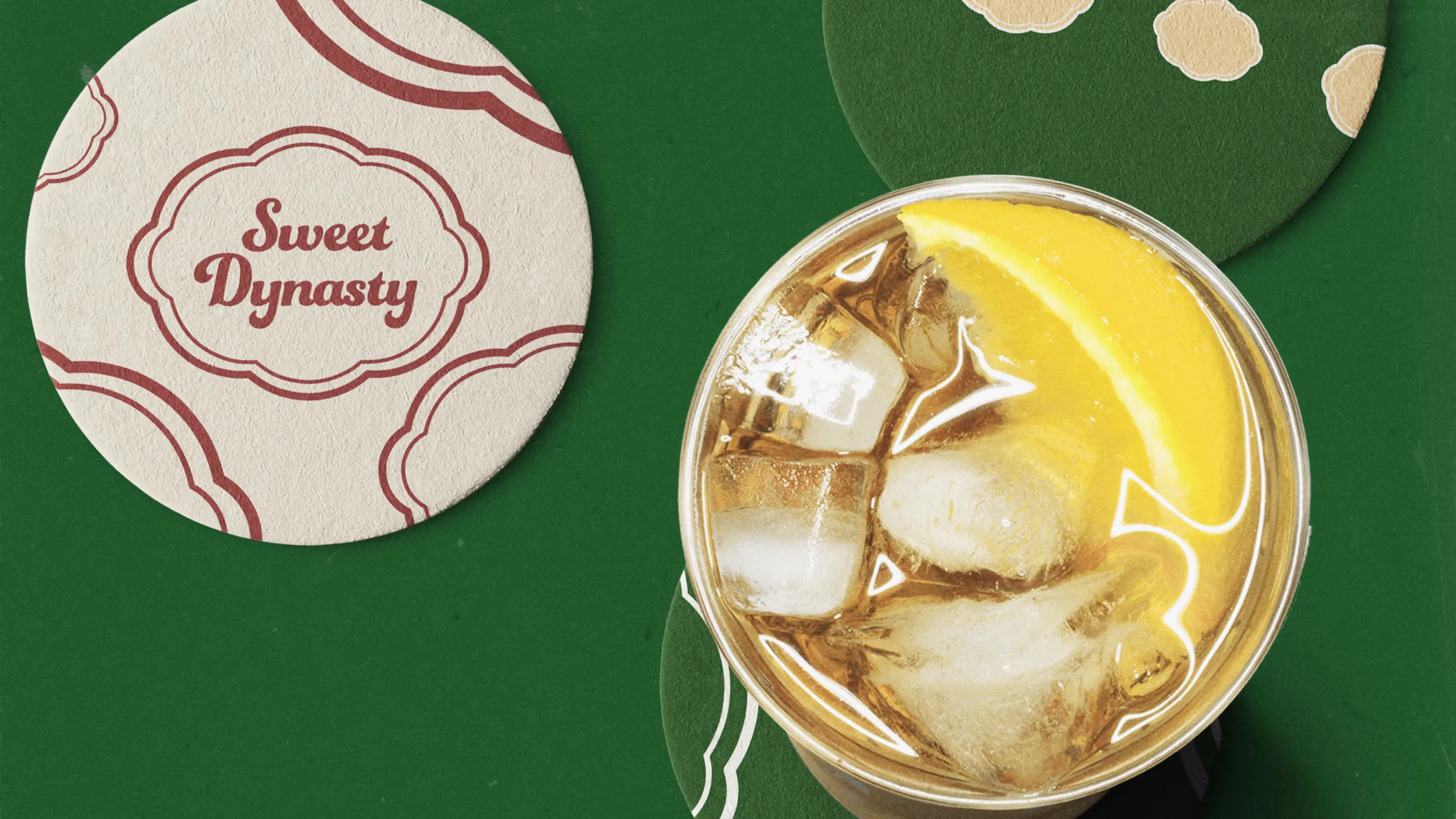
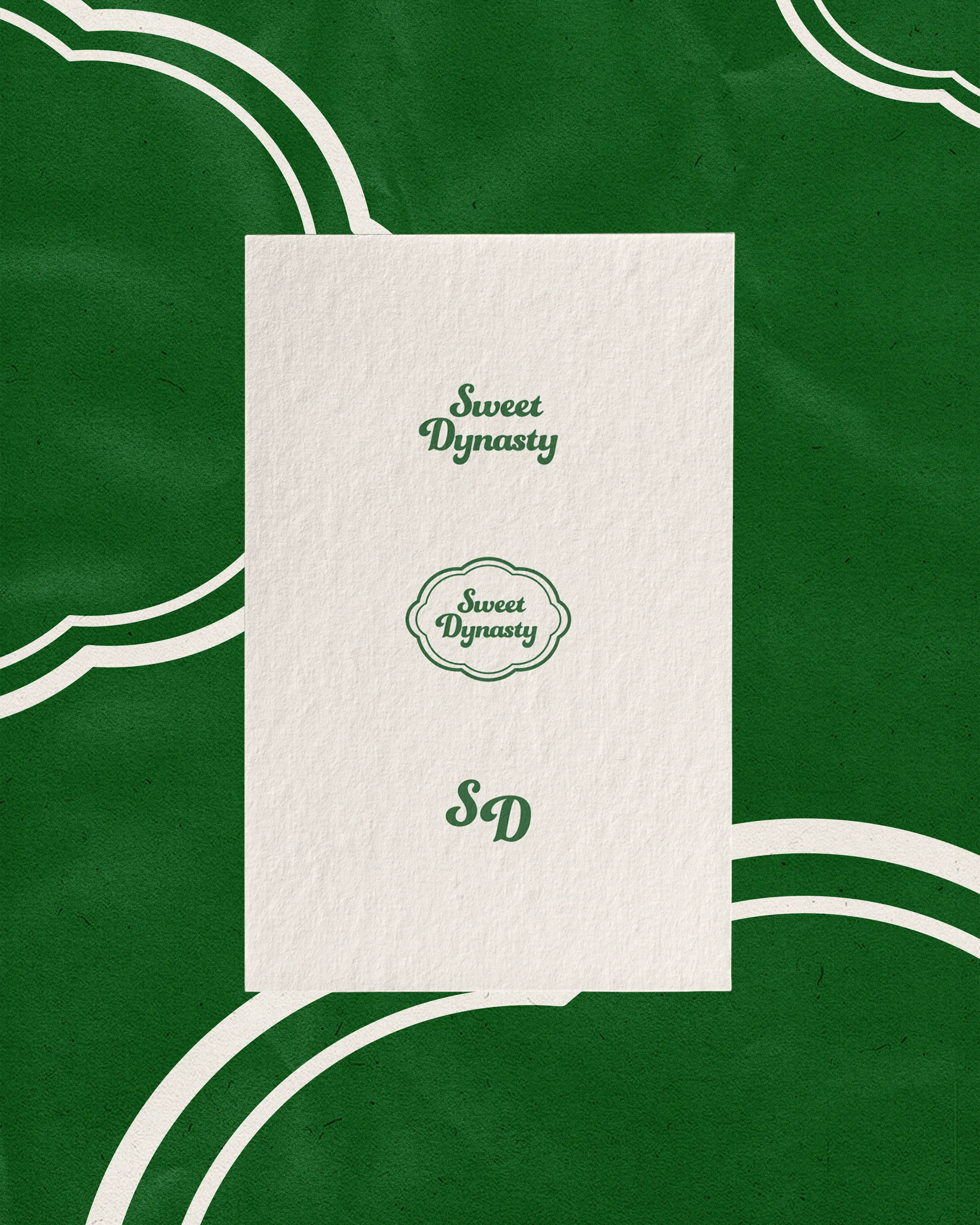
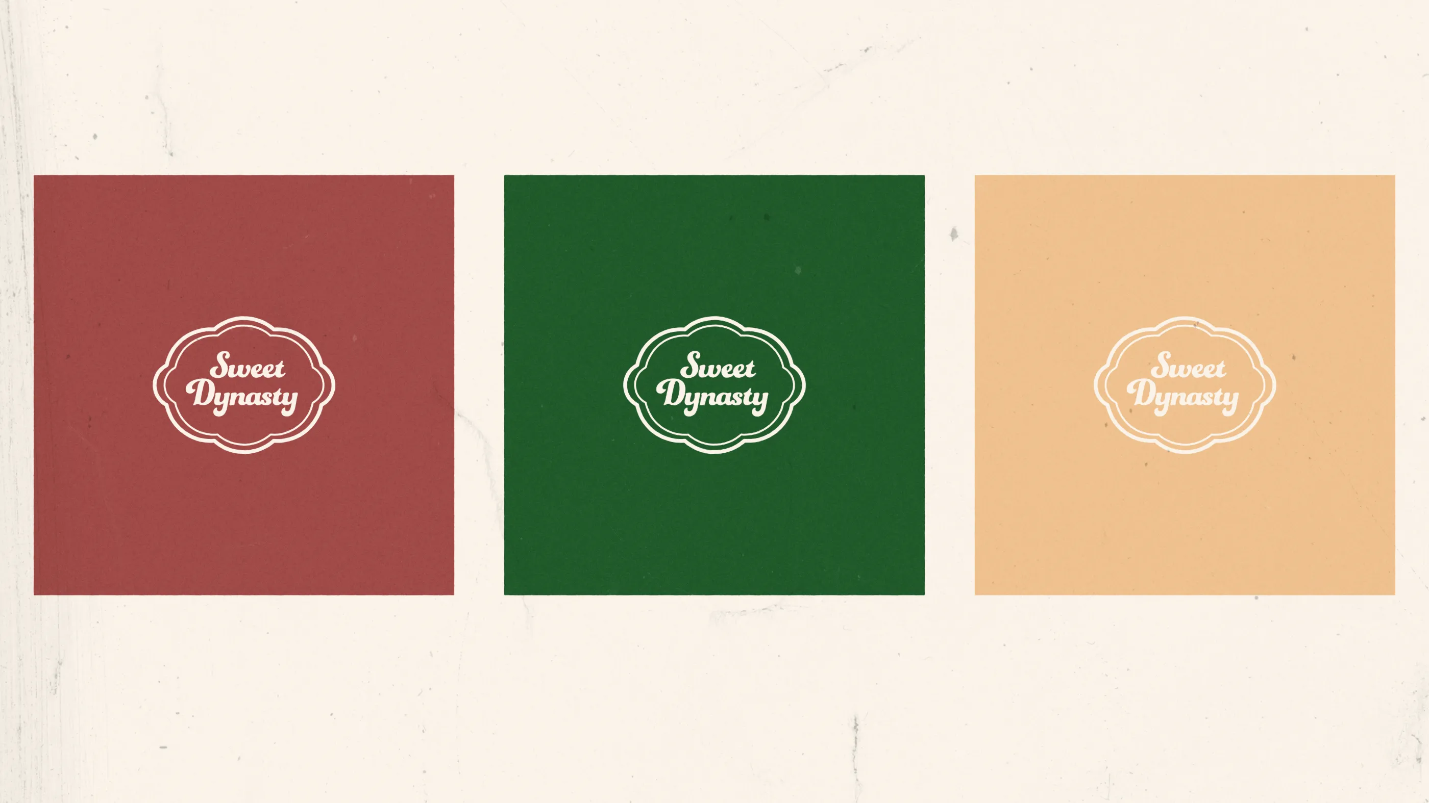
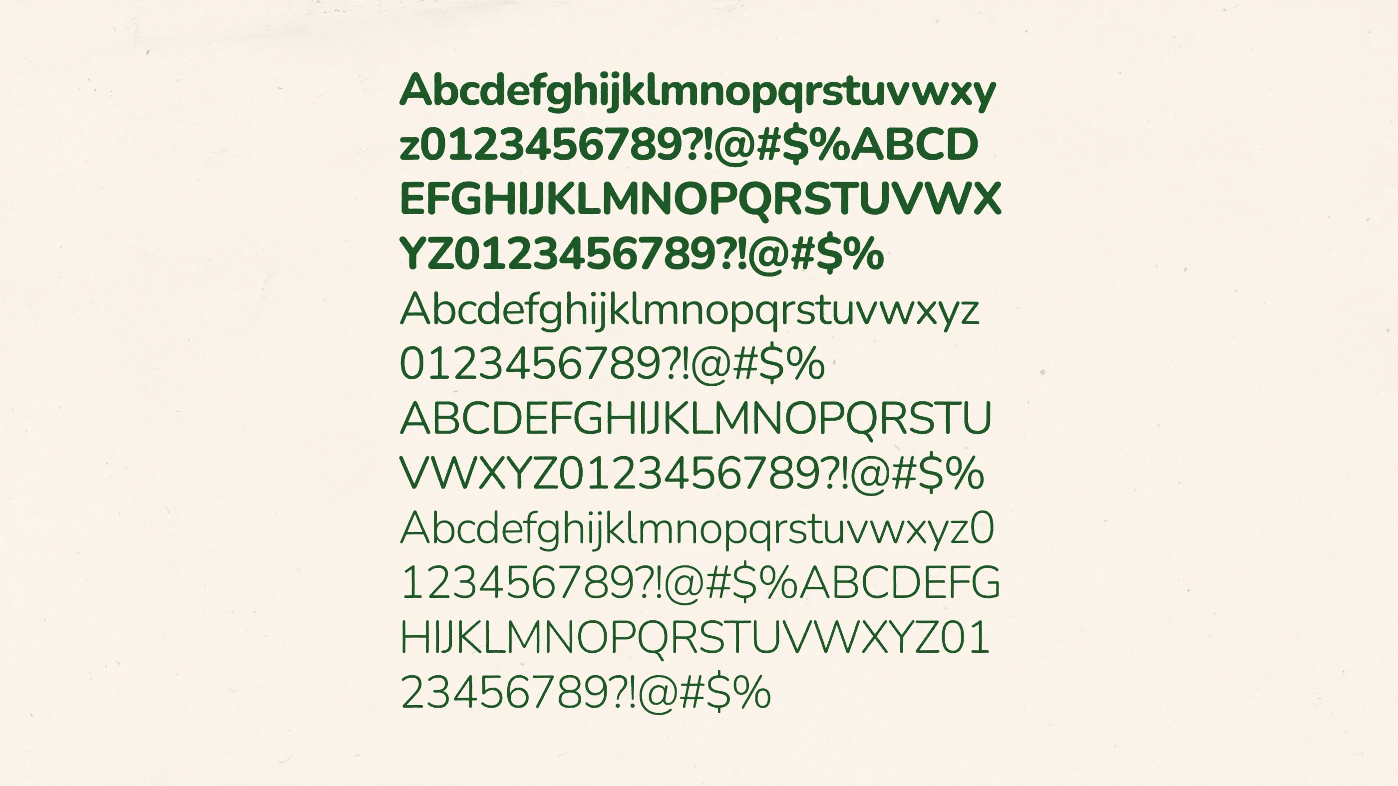
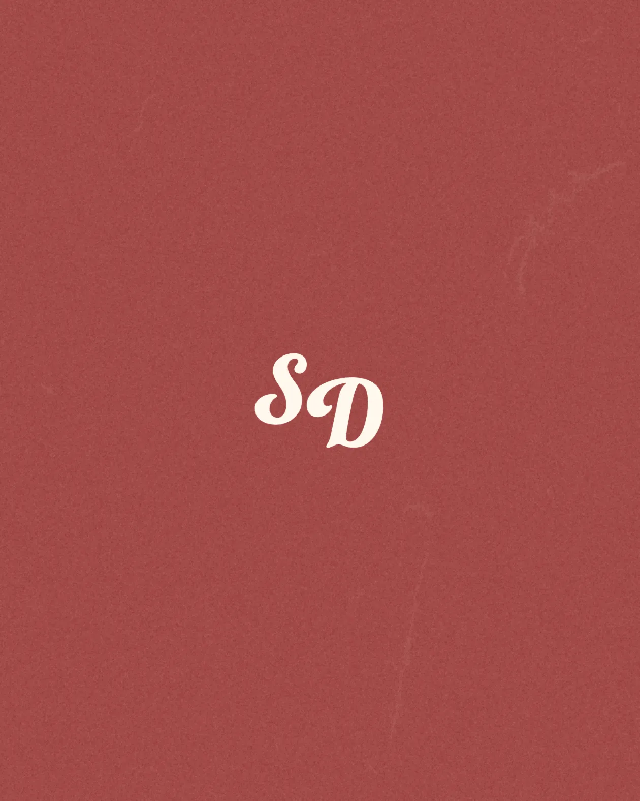
The palette comes directly from the source: red, green and soft yellow-white, colours that appeared repeatedly across lolly wrappers and snack packaging in Hong Kong at the time. he type follows the same logic, with rounder, softer letterforms closer to what you'd find on a lolly bag than a restaurant menu. Nothing here is designed to feel nostalgic in the abstract. It's built from what the actual era looked like on the shelf.
Sweet Dynasty
The corner dessert shop your family always went to, rebuilt as a brand.
Sweet Dynasty is a Melbourne dessert brand built around 1980s and 90s Hong Kong dessert culture, the kind of family-run shop that sold sweets and desserts on the same counter. The challenge was making that memory specific rather than generic, most "nostalgic" branding reaches for sepia and soft edges, which says nothing about which culture or which decade it's actually from.
The palette comes directly from the source: red, green and soft yellow-white, colours that appeared repeatedly across lolly wrappers and snack packaging in Hong Kong at the time. he type follows the same logic, with rounder, softer letterforms closer to what you'd find on a lolly bag than a restaurant menu. Nothing here is designed to feel nostalgic in the abstract. It's built from what the actual era looked like on the shelf.
Sweet Dynasty
The corner dessert shop your family always went to, rebuilt as a brand.
Sweet Dynasty is a Melbourne dessert brand built around 1980s and 90s Hong Kong dessert culture, the kind of family-run shop that sold sweets and desserts on the same counter. The challenge was making that memory specific rather than generic, most "nostalgic" branding reaches for sepia and soft edges, which says nothing about which culture or which decade it's actually from.
The palette comes directly from the source: red, green and soft yellow-white, colours that appeared repeatedly across lolly wrappers and snack packaging in Hong Kong at the time. he type follows the same logic, with rounder, softer letterforms closer to what you'd find on a lolly bag than a restaurant menu. Nothing here is designed to feel nostalgic in the abstract. It's built from what the actual era looked like on the shelf.
Service
Brand Identity
Brand Guidelines
Logomark and Logotype
Packaging
Poster
Menu
Year
2025






Next
SOHP Sourcing
2026

Next
SOHP Sourcing
2026
Next
SOHP Sourcing