SOHP Sourcing
The colour and marks of a factory floor, used as a brand's entire visual language.
SOHP is a Melbourne sourcing agency helping apparel brands navigate suppliers, materials, and everything that usually stays hidden between a design and the finished garment. Most of the industry sells on price and speed. SOHP's actual difference was showing the work, so the brand needed to prove that, not just claim it.
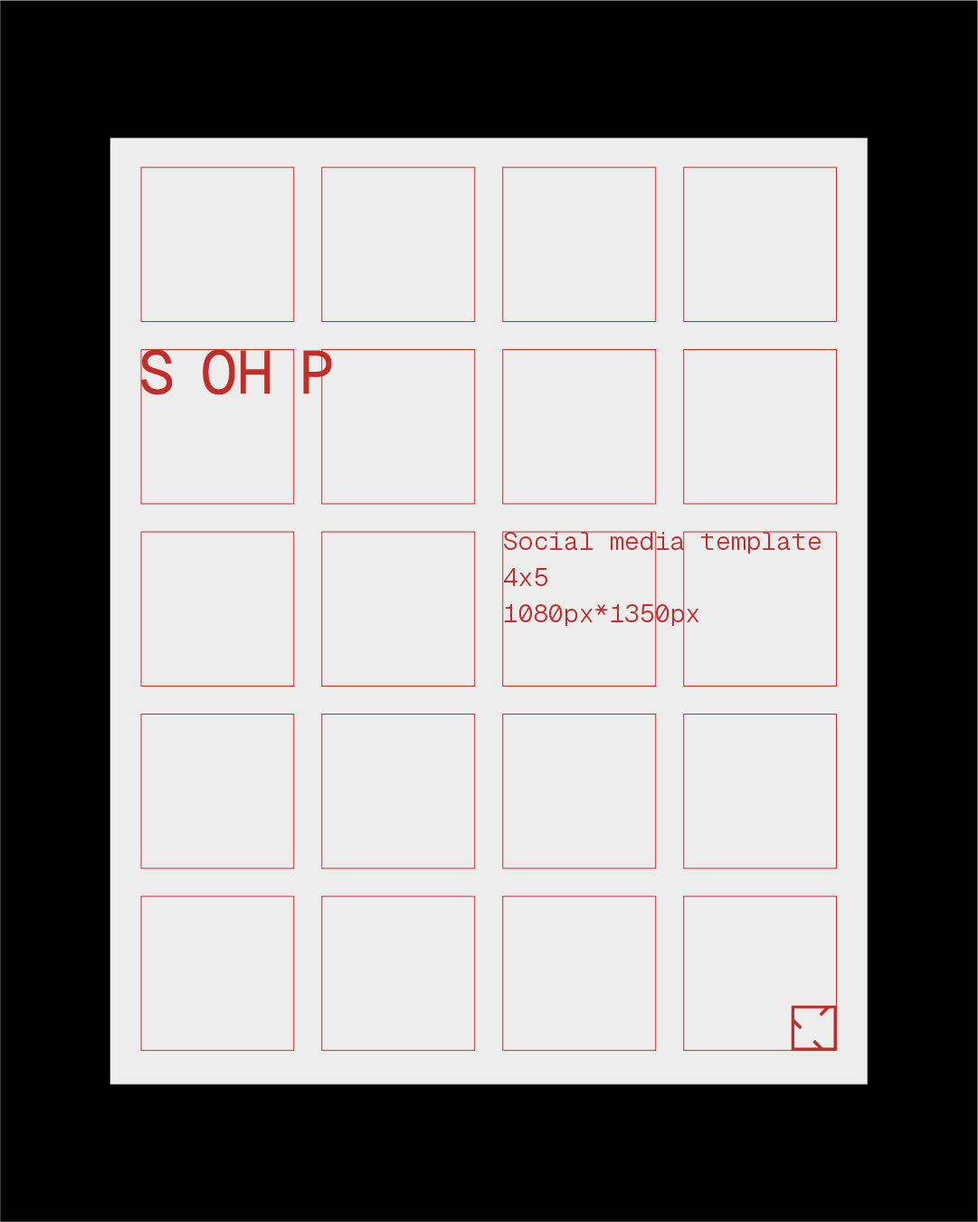
Rather than inventing a visual language, the design looked at the manufacturing floor itself. Cut marks from pattern-making became part of the logomark, the red comes from quality-control flags on spec sheets, and the typography sits closer to a bill of materials than a brand deck. The identity is designed to feel like something that actually belongs inside the manufacturing process.
SOHP Sourcing
The colour and marks of a factory floor, used as a brand's entire visual language.
SOHP is a Melbourne sourcing agency helping apparel brands navigate suppliers, materials, and everything that usually stays hidden between a design and the finished garment. Most of the industry sells on price and speed. SOHP's actual difference was showing the work, so the brand needed to prove that, not just claim it.
Rather than inventing a visual language, the design looked at the manufacturing floor itself. Cut marks from pattern-making became part of the logomark, the red comes from quality-control flags on spec sheets, and the typography sits closer to a bill of materials than a brand deck. The identity is designed to feel like something that actually belongs inside the manufacturing process.
SOHP Sourcing
The colour and marks of a factory floor, used as a brand's entire visual language.
SOHP is a Melbourne sourcing agency helping apparel brands navigate suppliers, materials, and everything that usually stays hidden between a design and the finished garment. Most of the industry sells on price and speed. SOHP's actual difference was showing the work, so the brand needed to prove that, not just claim it.
Rather than inventing a visual language, the design looked at the manufacturing floor itself. Cut marks from pattern-making became part of the logomark, the red comes from quality-control flags on spec sheets, and the typography sits closer to a bill of materials than a brand deck. The identity is designed to feel like something that actually belongs inside the manufacturing process.
Service
Brand Identity
Brand Strategy
Brand Guidelines
Naming and Nomenclatures
Logomark and Logotype
Packaging
Poster
Social Media
Year
2026